A Clearer Path to Better Health
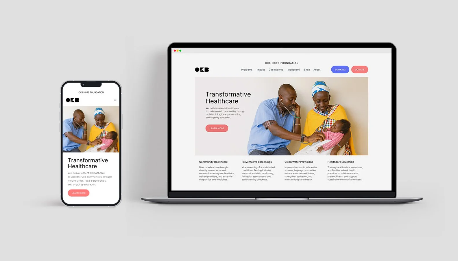
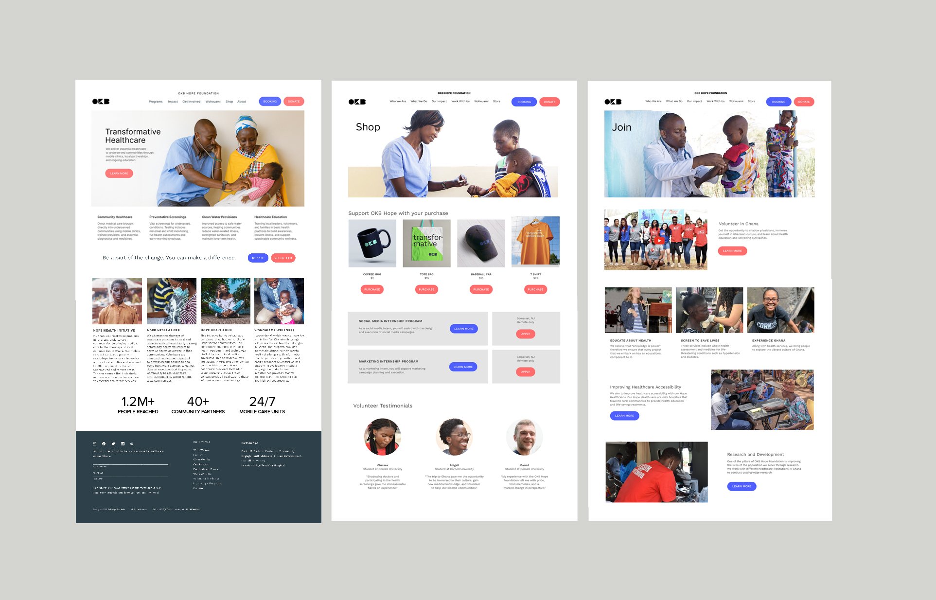
An NGO working to expand healthcare access across Ghana needed a digital presence that could effectively support two essential groups: donors seeking transparency and measurable impact, and community members who rely on the site to make appointments, access information, and understand available services in regions where medical support is often limited or hard to reach.
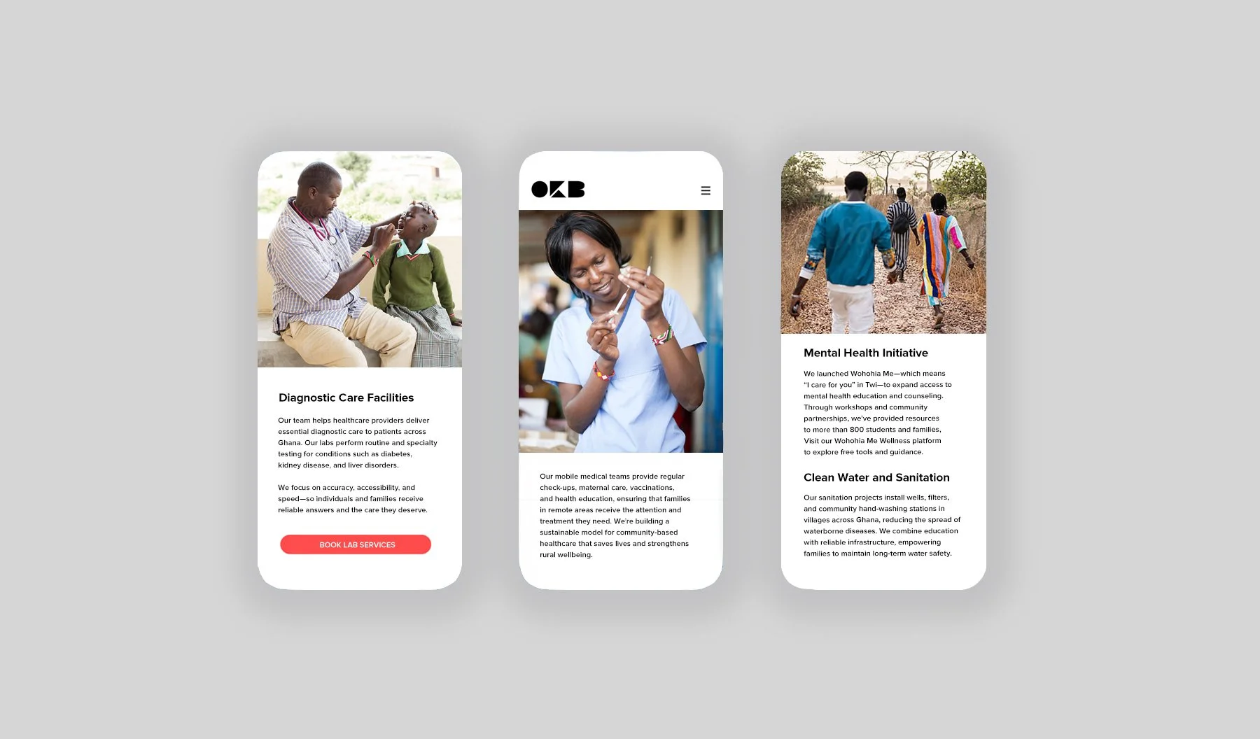
The brand identity and website were refined to create a structure that is clear, modern, and easy to navigate. Beginning with UX wireframes, the experience was reorganized to simplify movement through the site, highlight key initiatives, and present the organization’s commitment to equitable care with greater immediacy. Human-centered photography, straightforward typography, and intuitive paths for both giving and scheduling reinforce trust while keeping essential actions simple and direct.
Color brings warmth and authenticity to the system. Instead of traditional clinical palettes, the design draws from the bright and varied tones found in Ghanaian villages, creating a digital environment that feels connected to the communities the NGO supports. The result is a more accessible brand and website that communicate purpose, strengthen donor engagement, and make it easier for users to access care when they need it most.
Agency
Vertical
Client
OKB Foundation
Location
Chicago
Role
Brand Identity
Copywriting
UX/UI Design

Team
Client
Osei Boateng
Developer
Claire Wang