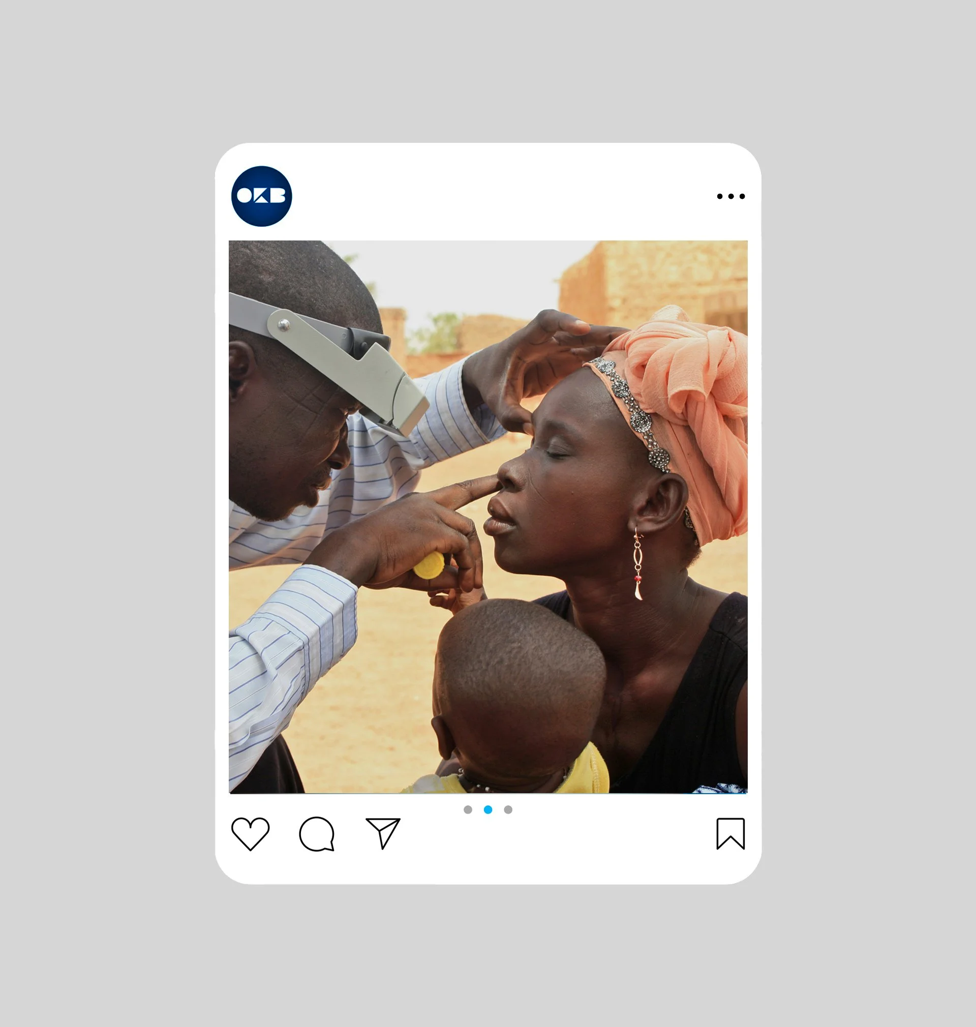
Healthcare That Lifts Communities
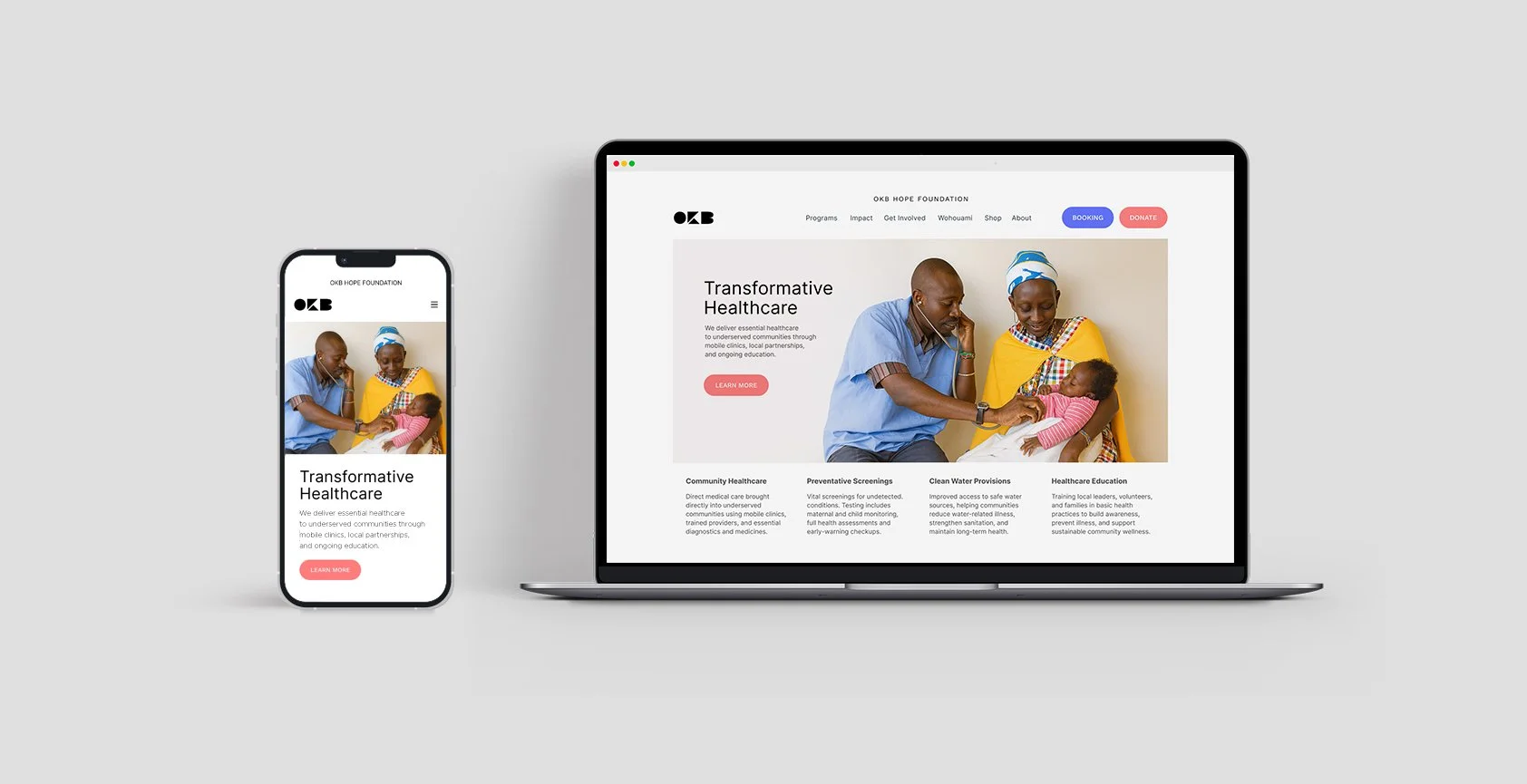
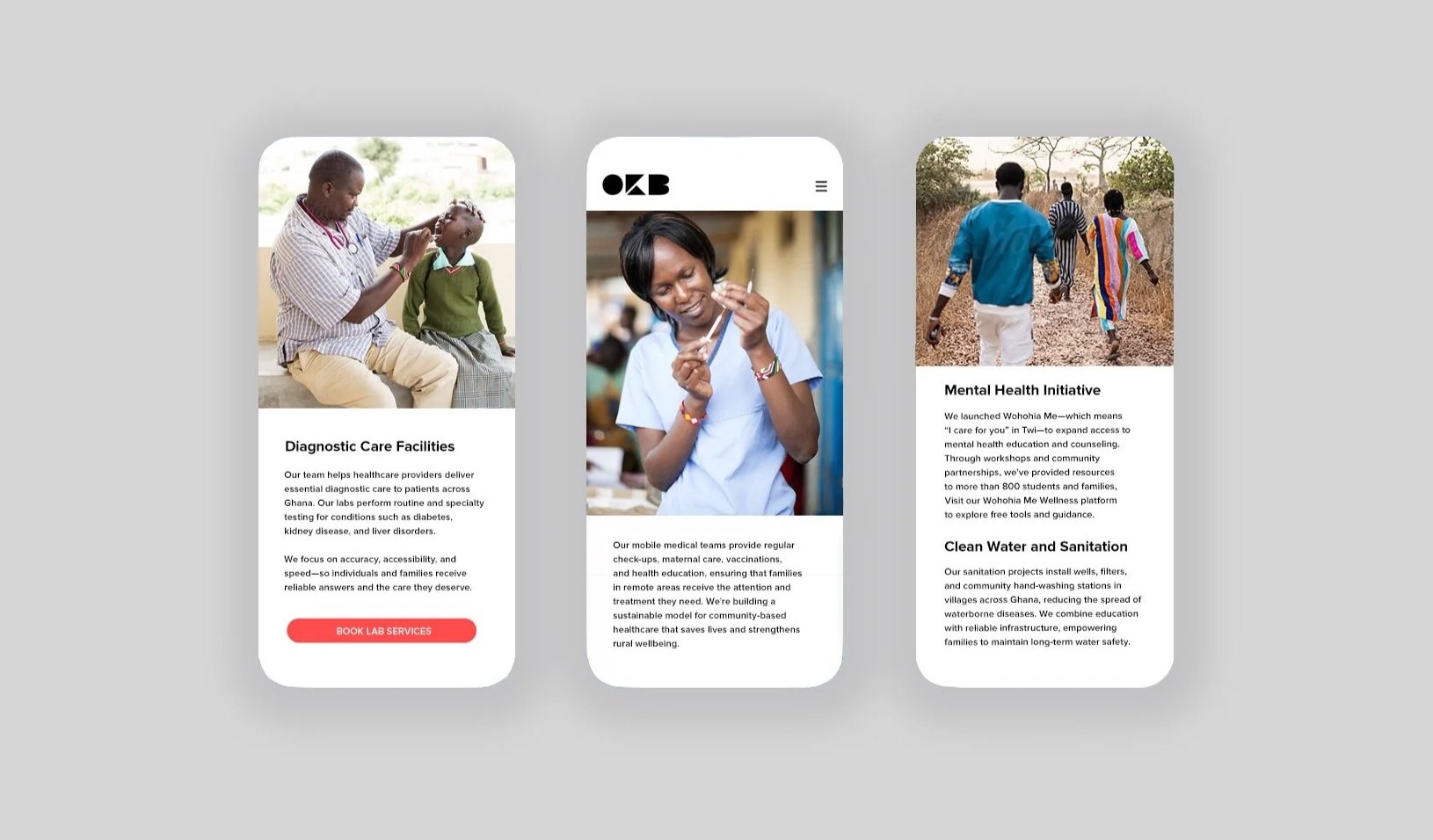
An NGO working to expand healthcare access across rural Ghana, the organization needed an identity that reflects a focus on community, clarity, and trust. The visual system aims to feel warm and human while remaining organized enough to support medical communication across donors, volunteers, staff, and the people relying on its services.
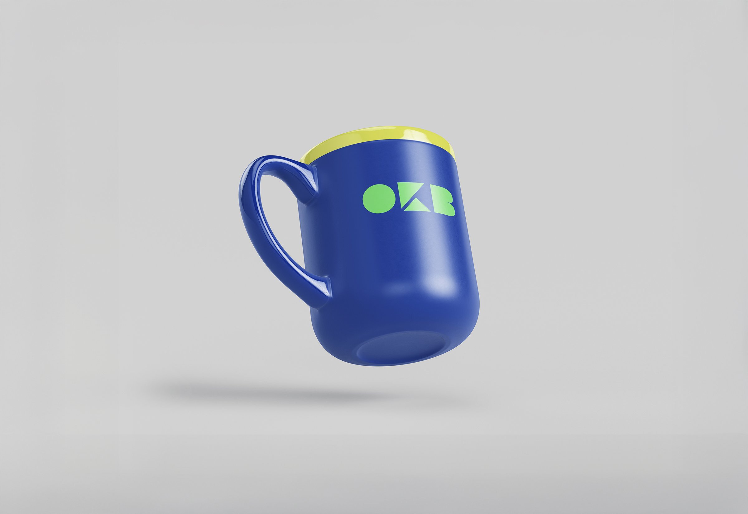
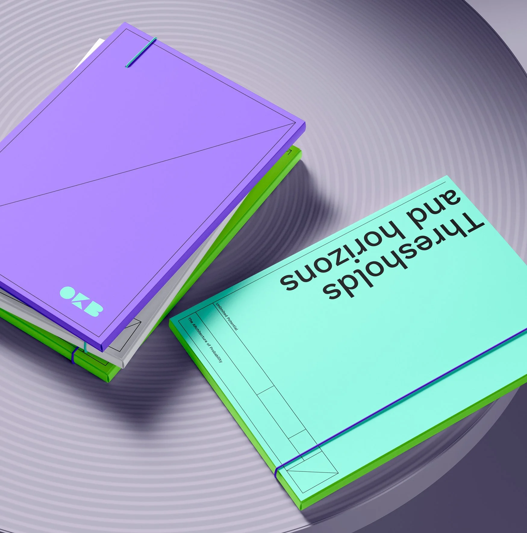
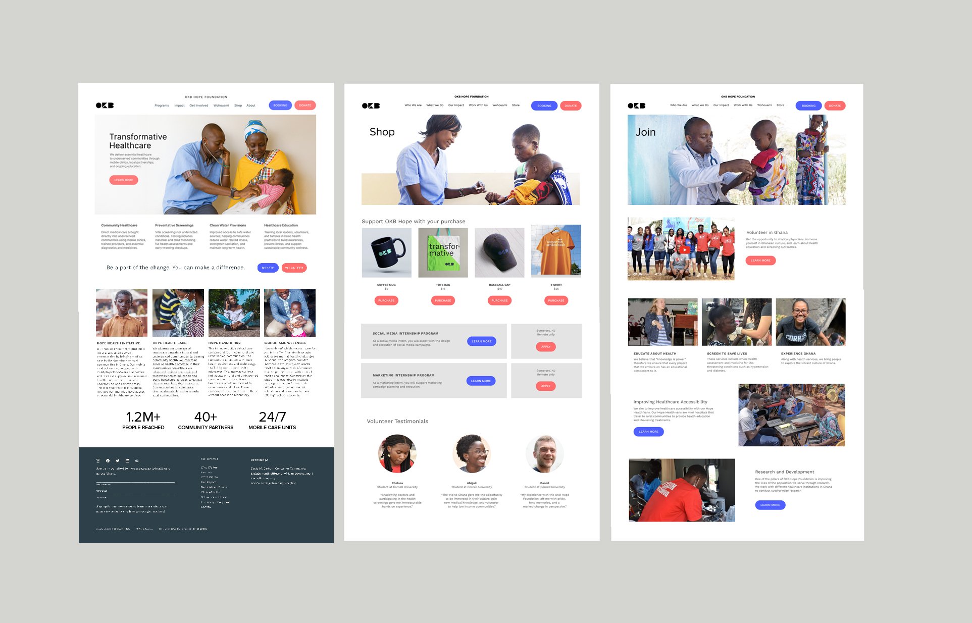
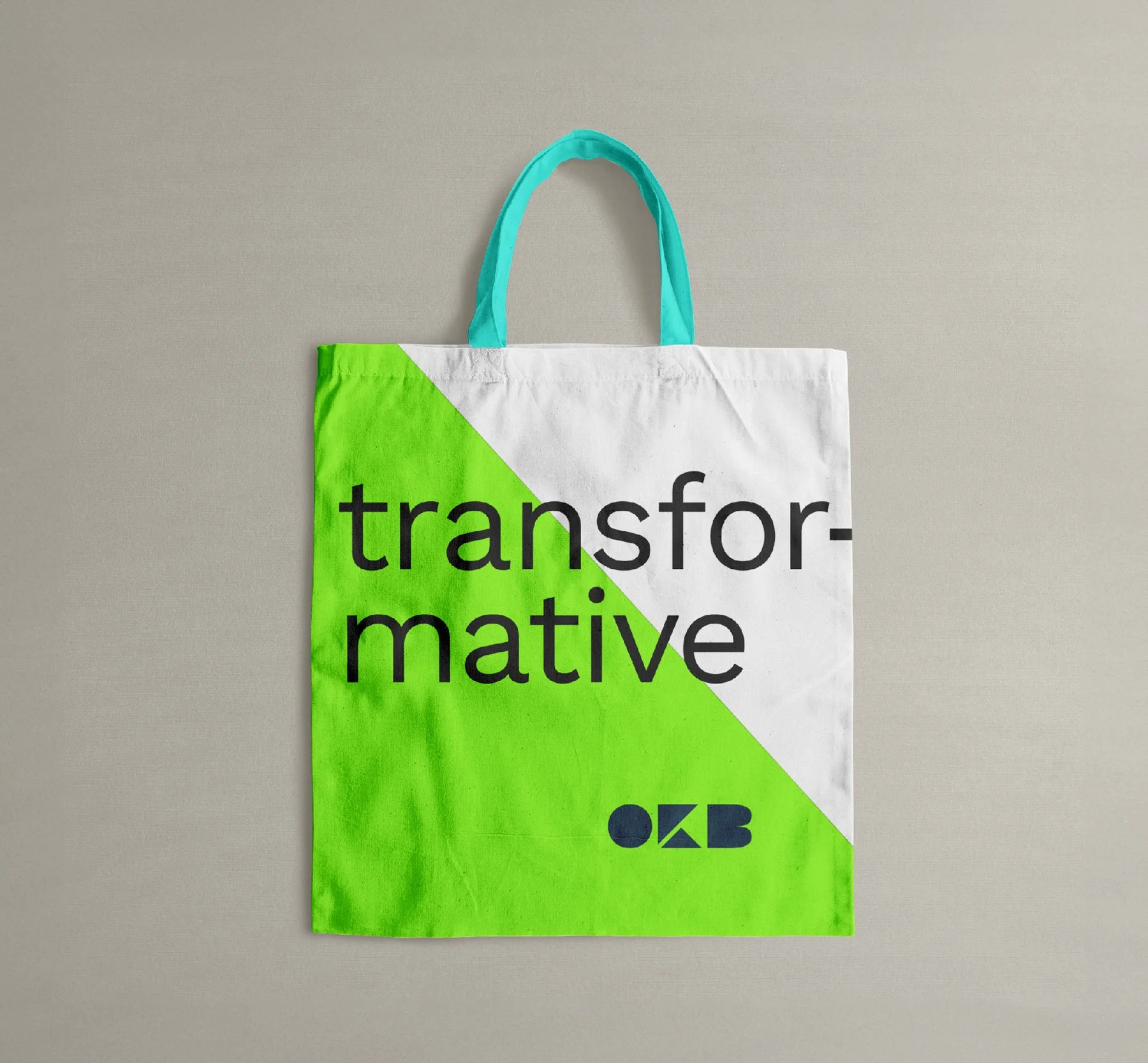
Color plays a central role. Instead of defaulting to traditional healthcare palettes, the identity draws from the bright and varied tones found throughout Ghanaian villages. These colors create an authentic sense of place and convey optimism without drifting into sentimentality. Typography stays modern and straightforward so information reads clearly, whether it is appointment details, service information, or donor outreach. Photography emphasizes real environments and real people, grounding the brand in lived experience rather than abstract symbols or generic stock imagery.
Graphic elements and layout structure are built around accessibility. Content is easy to scan, navigation feels familiar, and the overall tone remains direct and human-centered across print, digital, and environmental expressions. The result is an identity that feels warm, confident, and grounded in reality, a reflection of an organization working at the intersection of community, healthcare, and meaningful impact.
Agency
Vertical
Client
OKB Foundation
Location
Chicago
Role
Brand Identity
Copywriting
UX/UI Design

Team
Client
Osei Boateng
Developer
Claire Wang