Extending Identity Into Measured, Tactile Form
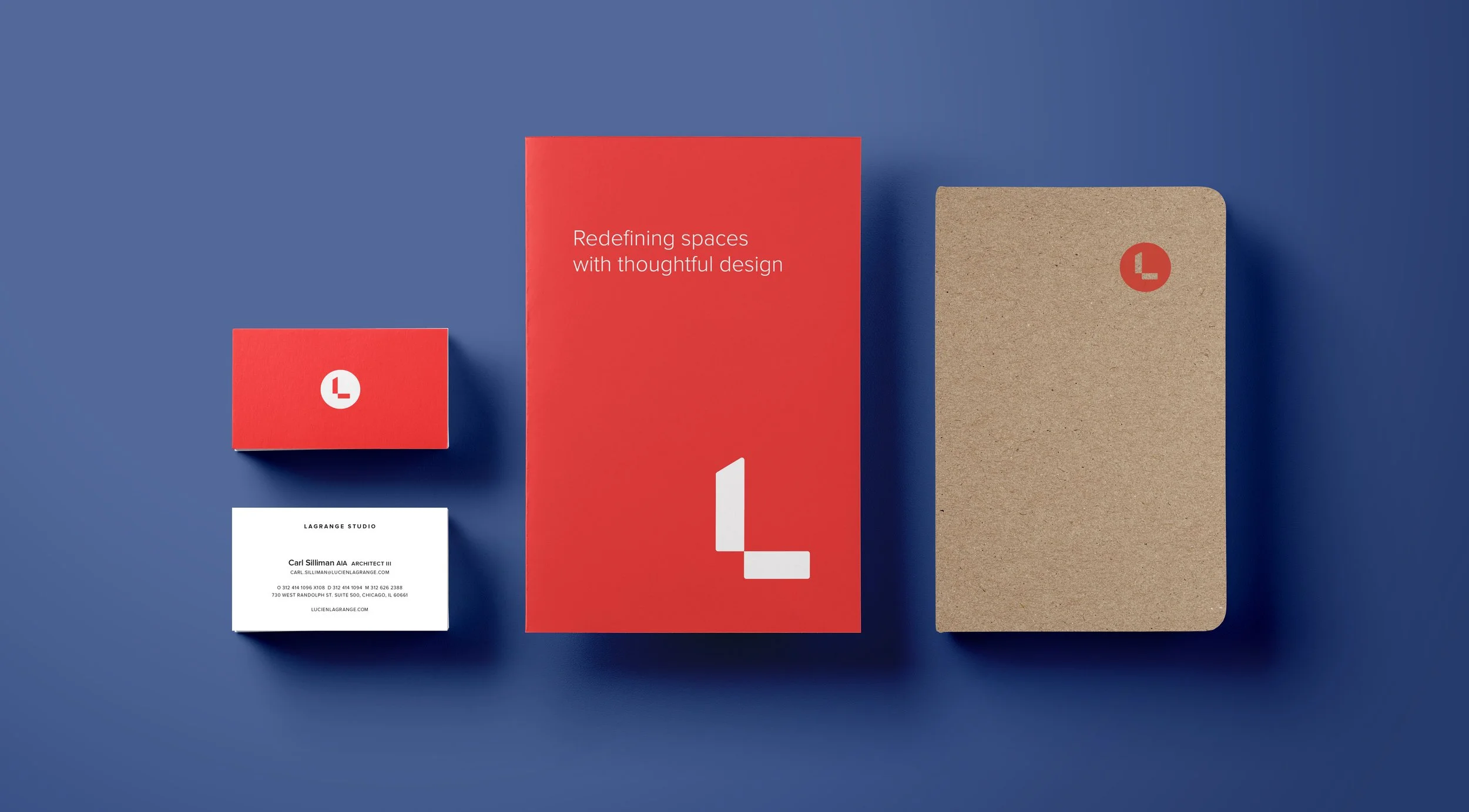
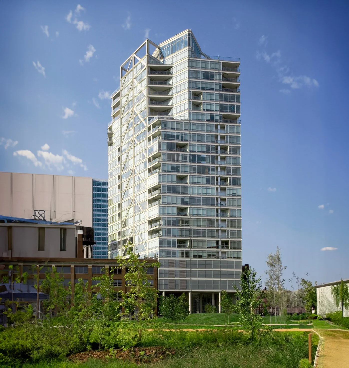
As a long-established Chicago architecture practice known for luxury residential towers and landmark hotels, Lagrange Studio approaches its work with a focus on proportion, material clarity, and restraint. The print system extends these principles into physical form, translating the studio’s architectural sensibility into brochures, booklets, and everyday collateral. The materials were developed as a conceptual print system to guide future applications and present a unified brand direction.
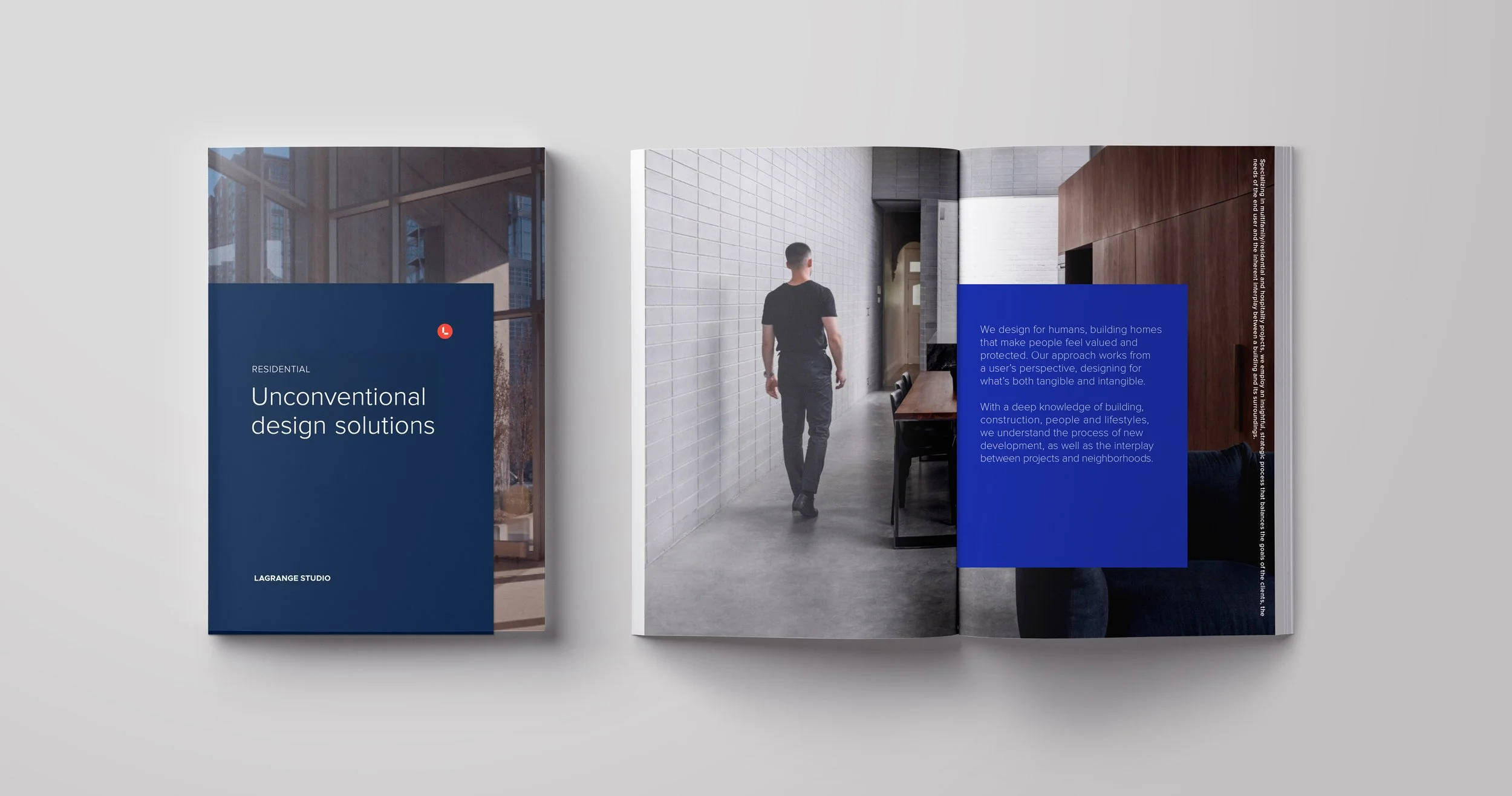
Printed pieces were designed to feel measured and intentional. Layouts use generous spacing, disciplined typography, and a restrained palette that reflects the firm’s emphasis on structure and hierarchy. Paper stocks were selected for their subtle texture and weight, echoing the craftsmanship and material rigor present in the studio’s buildings. Business cards, stationery, and supporting collateral follow the same approach—simple compositions, precise alignment, and information presented without embellishment.
Across the system, the goal was to communicate the studio’s character through proportion and clarity rather than decoration. Each piece functions as a quiet extension of the brand, reinforcing the studio’s architectural values and presenting a consistent, confident point of view.
Agency
Vertical
Client
Lagrange Studio
Location
Chicago
Role
Creative Director

Team
Director
Lucien LaGrange
Partners
Alfredo Marr
My-Nga Lam