Momentum Made Visual
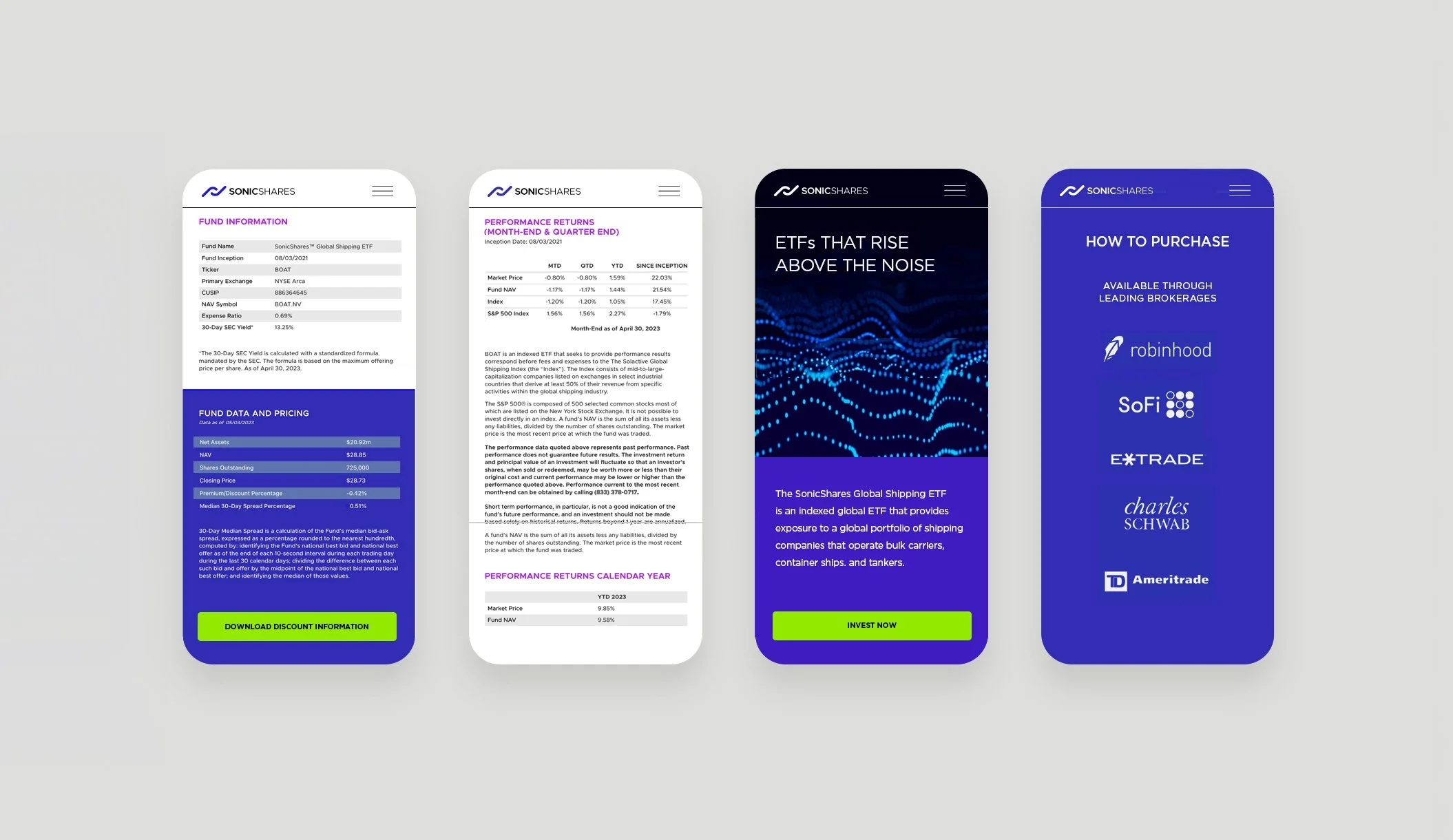
This actively traded ETF focuses on hospitality, airlines, and shipping—industries defined by movement, global flow, and rapid demand shifts. The identity needed to communicate stability in a volatile landscape while still capturing the energy behind these sectors.
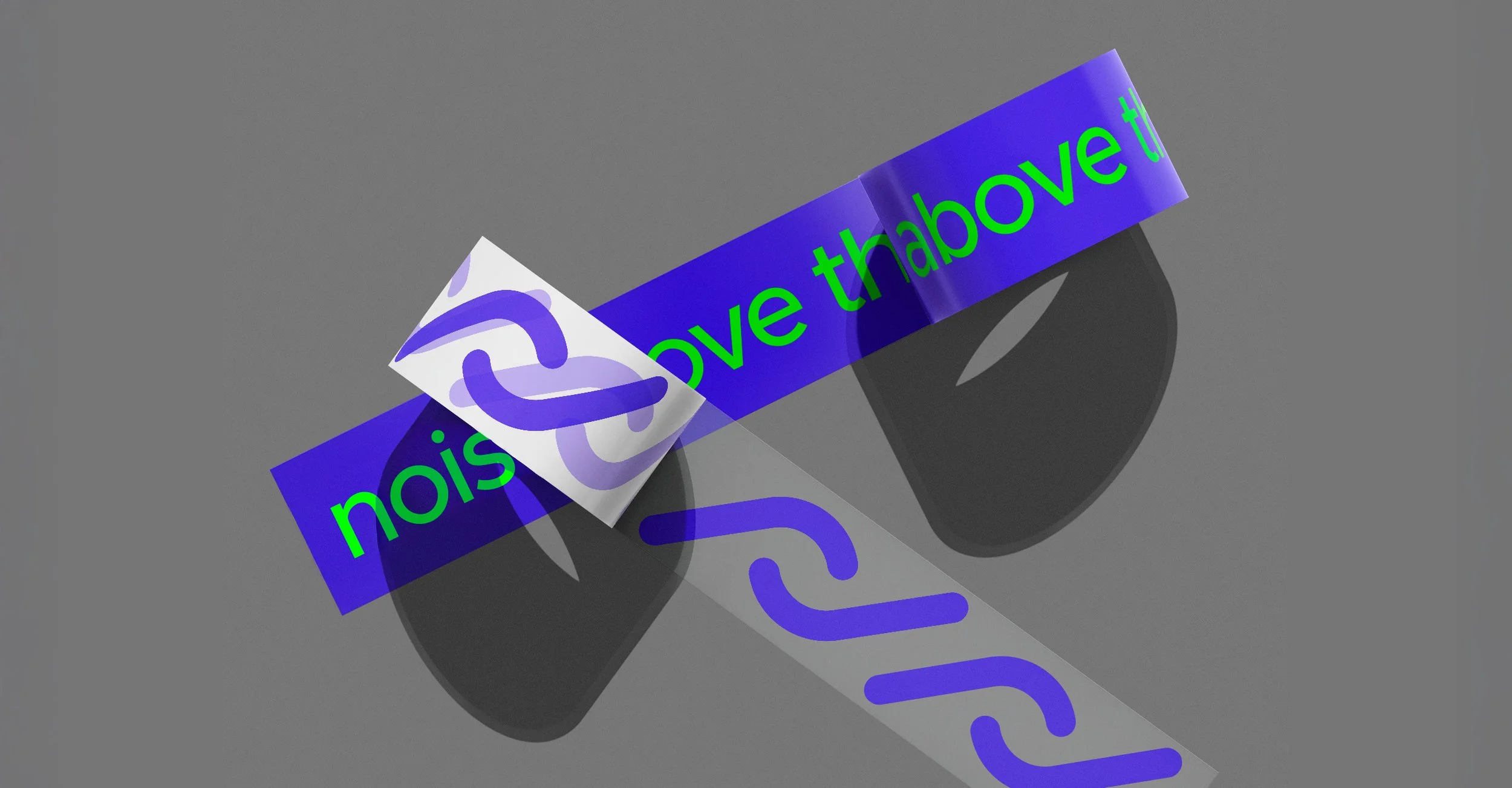
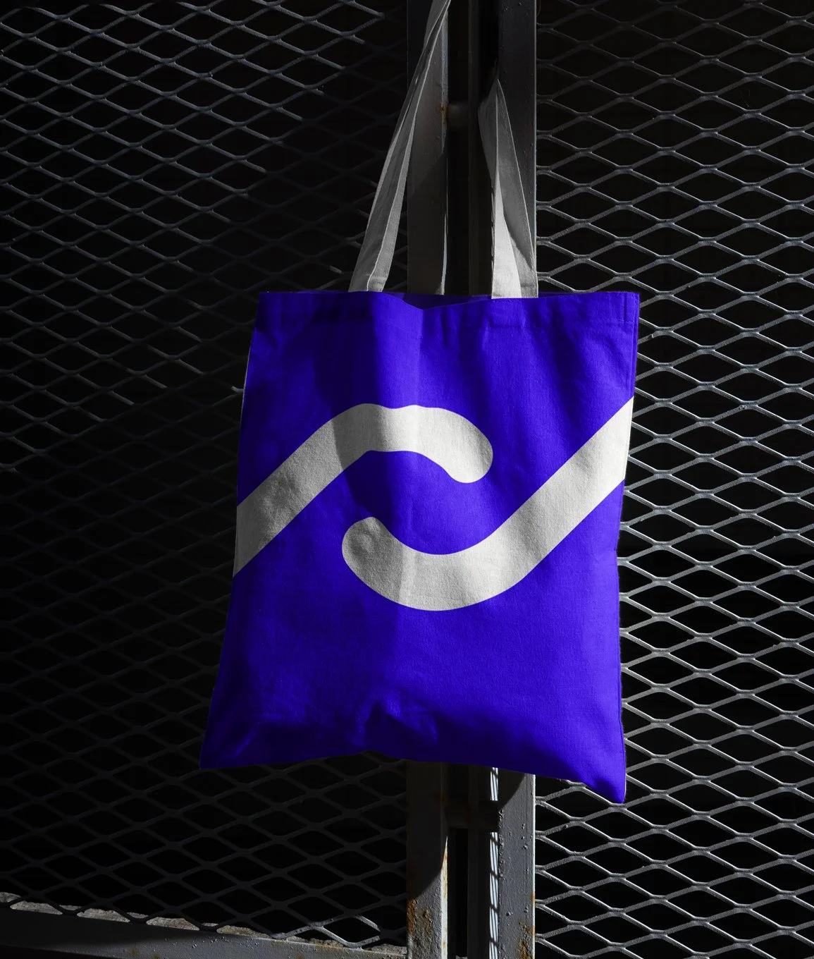
The symbol is built from a modified “S,” angled to create an inflection point—a moment where direction changes and decisions are made. It also nods to the universal power icon, reinforcing ideas of activation, confidence, and forward motion. The result is a mark that feels analytical and dynamic, connecting finance to the real-world industries behind it.
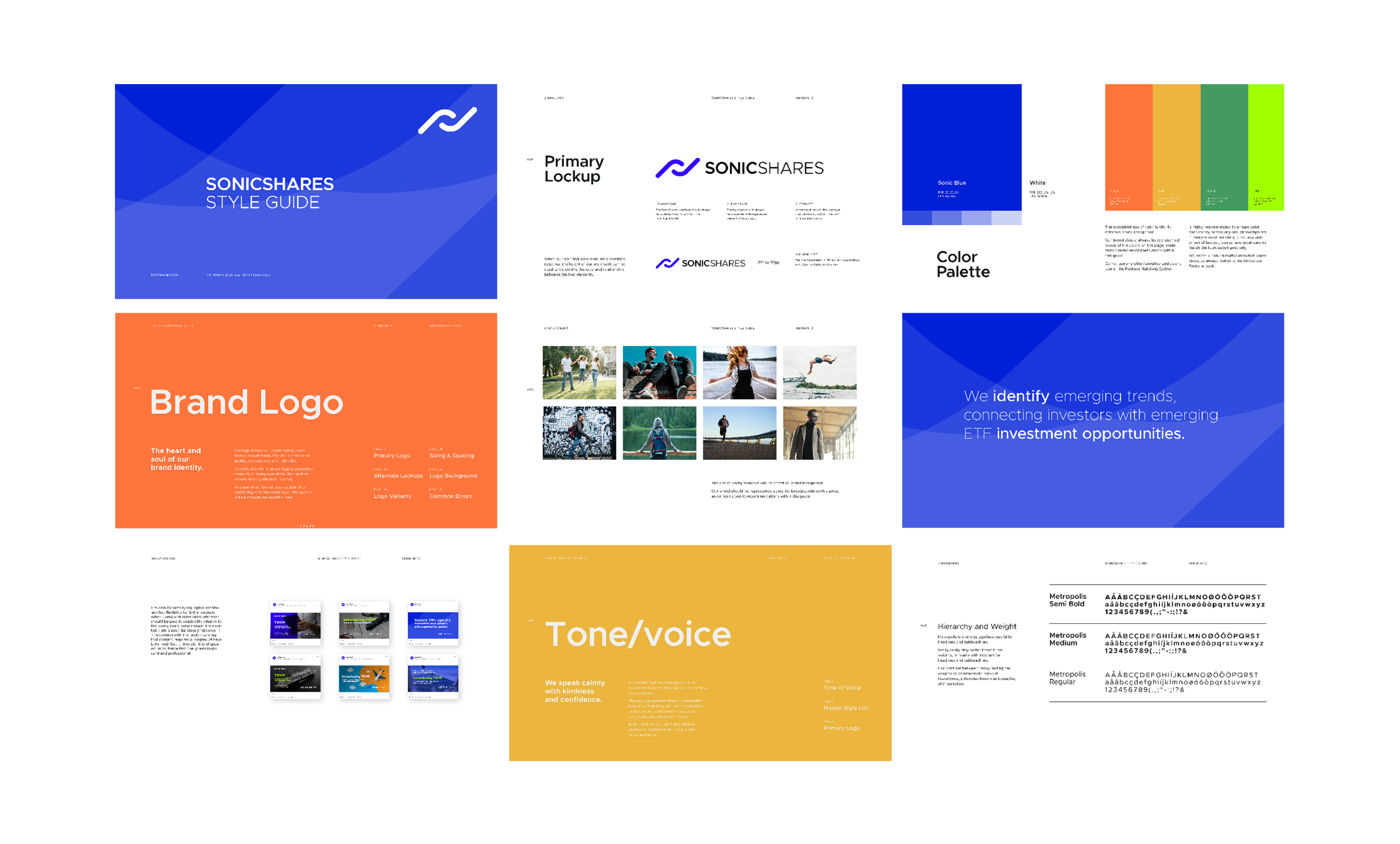
The visual system extends beyond a static logo. Motion treatments emphasize acceleration and global movement, while print and digital layouts focus on clarity, transparency, and simplicity. The toolkit works across investor presentations, marketing materials, screens, and social platforms without losing coherence.
The identity balances credibility with momentum—giving the fund a visual language that’s confident, accessible, and built for sectors defined by constant change.
Agency
Vertical
Client
Tidal
Location
Chicago
Role
Brand Design
Design Direction
Web Design
Campaigns


Team
Marketing Director
Leann Gaines
Copy
Guillermo Trias