A Unified Construction Platform
Four construction-tech companies merged into a single platform, each with its own audience, history, and visual language. Years of disconnected branding needed to be brought together without erasing the distinctions that mattered to people using the products every day.
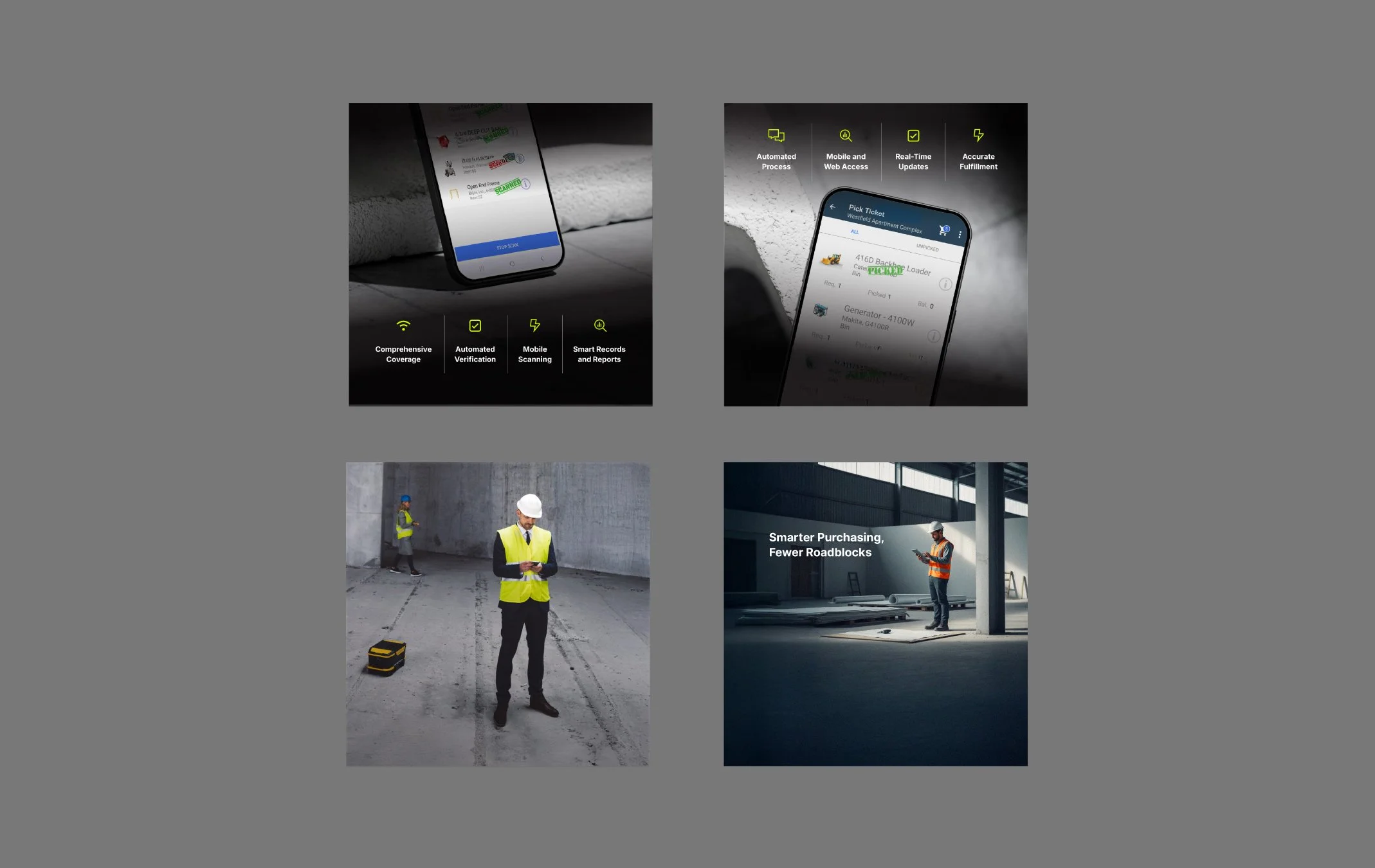
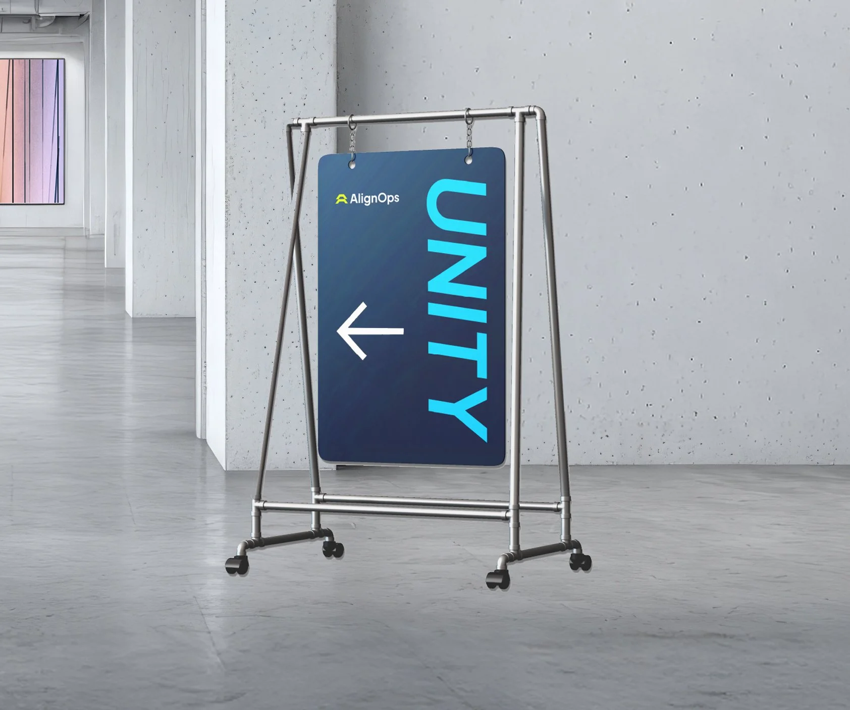
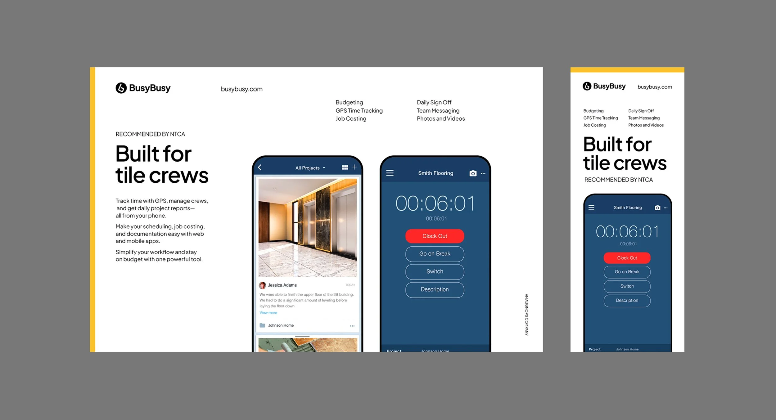
I defined the identity architecture that links these products under one system. Typography, grids, iconography, and color were rebuilt into a modular framework that lets each product keep its character while making the entire ecosystem feel connected and intentional.
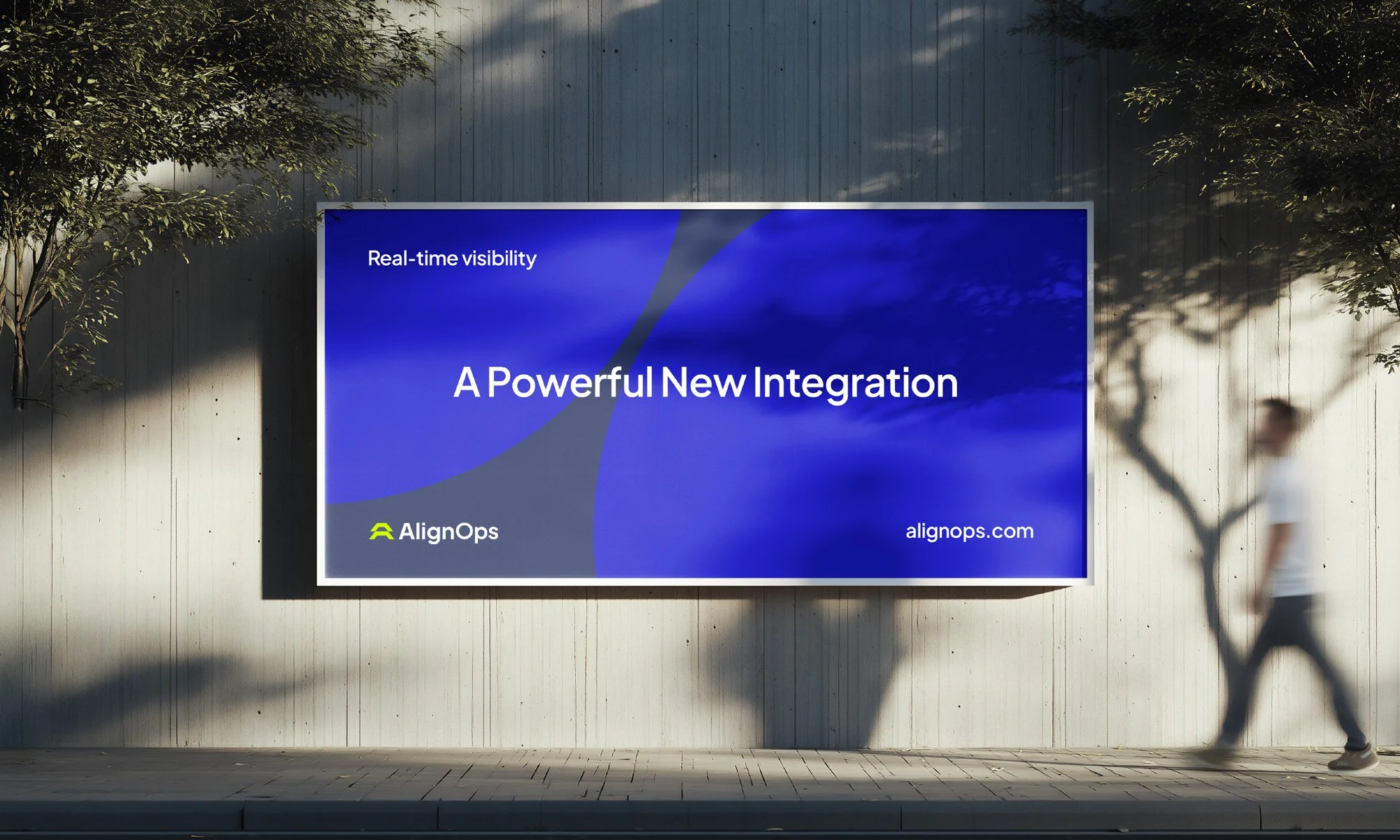
Color became the key organizing tool, giving every category immediate recognition. Structural consistency in type, spacing, and hierarchy set the foundation for everything downstream—product materials, onboarding, marketing, presentations, and internal communication.
The result is a unified identity system that turns a fragmented collection of brands into a navigable platform and makes the organization stronger, clearer, and far more coherent than what existed before.
In-House
AlignOps
Location
Chicago
Role
Brand Designer


Team
Chief Marketing Officer
Meg Zolnierowicz
Director of Demand Generation
Parker Clarke
Sr. Content Marketing Specialist
Sadaf Momin
Product Marketing Manager
Rachel Palmer